
A leaner site for 2024
Discussing a few changes to the website's backend, mostly in service of wasting less network bandwidth.
Hey - long time no see!
I’ve been tweaking this site quite a bit lately, and part of that has been focussing on improving some bloat the website’s had for a while now. It’s not like the site’s been amassing bloat over time, or even that it’s particularly large - it’s not! - but some of the stylistic decisions I’ve taken when I first set this up a few years ago have been particularly inefficient, and due a bit of refinement.
Images are big
Generally speaking, text is really easy to store and transmit. If you’re worried about the size of your HTML file or whatever, it compresses really well, and even without compression a site like this would easily fit in any reasonable bandwidth without an issue.
Images, on the other hand, are comparatively large - exponentially so depending on the resolution and (depending on the file type) quality of the image. Thus, we encounter the first thing that’s changed: the introduction of responsive images.
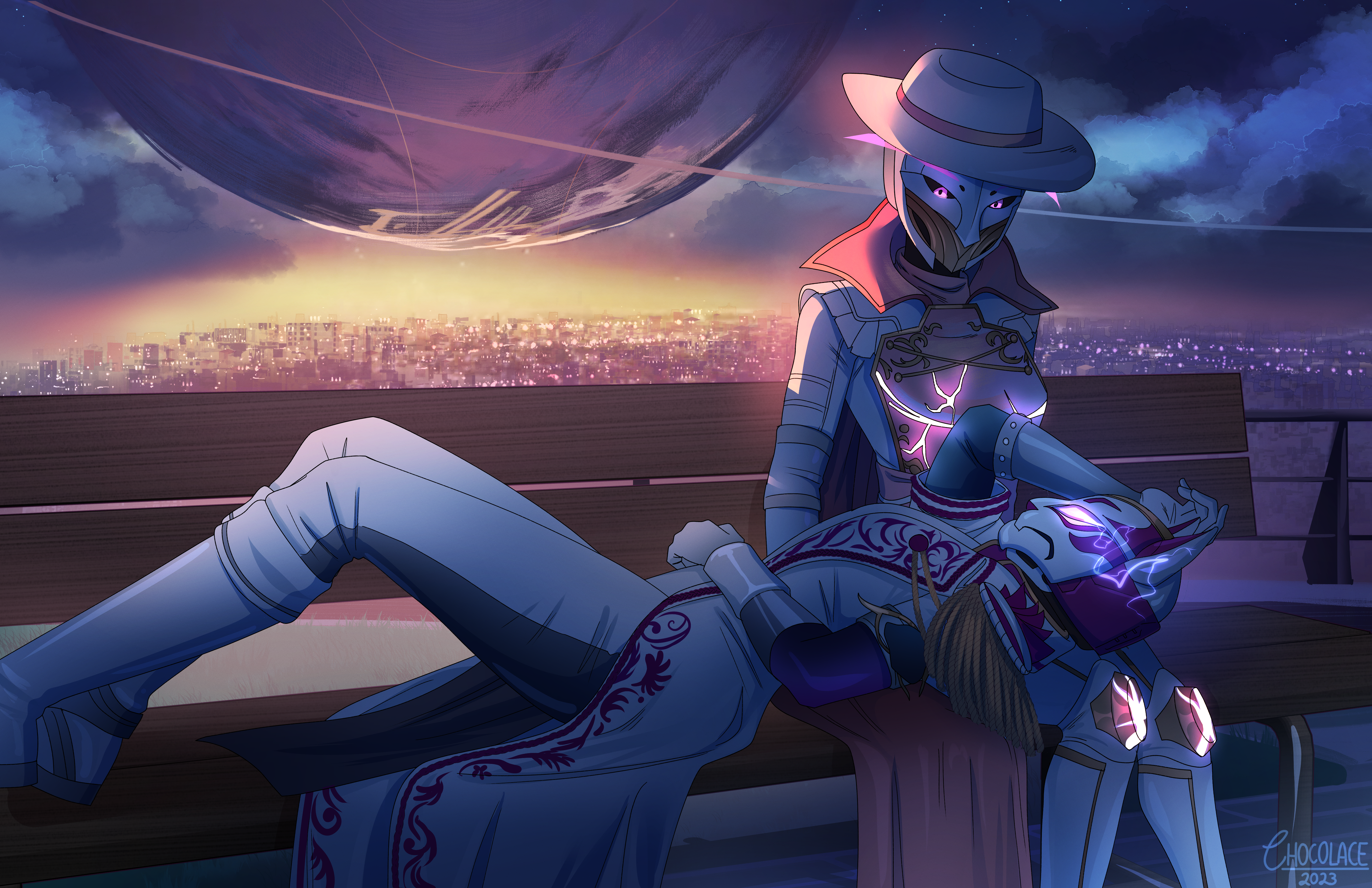
You might notice that the design of this website strongly favours - or rather, mandates - a single very large image on each page. Generally, each section on the site (blog, and so on) has a specific “hero image” attached to it, which you can see an example of right above this post. It covers the full width of the display area, and mostly just shows off some of the amazing artworks I’ve commissioned from Chocolace over the years whilst also housing my profile widget. I’m a big fan of this design in principle, so much so that the home page takes this to the logical extreme with a full display of such an image, filling up the entire render area.
Unfortunately, this brings us around to resolutions… You see, as you might notice from my /uses page, I use a 1440p monitor primarily, which means I’m incentivised to use the highest resolution images I reasonably can just so they look crisp for me (which, frankly: if you don’t enjoy the site you’ve made, then what’s the point, really?). This works, of course - subject to the speed of the webserver (which, surprisingly, Github Pages doesn’t seem the fastest, but I can’t really expect much from a free service) - but can be incredibly wasteful.
To provide some context: the hero page that I assigned to the blog - this gorgeous piece depicting my Destiny 2 Hunter and Warlock characters is over 5,000 pixels wide. On disk, that’s over 22 mebibytes! Compression, thankfully, spares the brunt of that size when actually transmitting it to - say - your mobile phone… But it’s not a miracle technology, so that particular image was still using up 5 MiB each time it needed to be loaded, which is incredibly wasteful both for people’s mobile data plans and simply taking a little longer than it really ought to - especially on a phone, where the screen is comparatively small!
To combat the impact of images across the site, I’ve been systematically introducing the usage of Zola’s image processing function, starting with the low-hanging fruit: images that are never going to be bigger than a fixed size.
Inline images and blog post previews
Standard practice to avoid websites being unwieldy on ludicrously-wide monitors (like my friend’s Super-Ultra-Wide, which is the width of two decent-sized monitors put next to each other) is to have a column in the center with a known maximum width, so your content never becomes too unreasonably wide. You’ll see that across the site, where all of the content adheres to a fixed maximum width of (currently) 768px.
The implication of this, then, is that any inline images – such as those included in blog posts or post previews – are only ever going to render at a maximum width of 768px! So sending a higher resolution image is wasteful, since that’s simply going to be downscaled to that resolution anyway: so, doing that in advance and just sending the image resolution that’s needed will make the site just a little bit leaner. Thus, thanks to a little shortcode I wrote for this purpose, every image in my blog posts are now a thumbnail image that Zola generates, which links to the full image if you want it:
<!-- Shortcode: `img` -->
<!-- Usage: img(path="some_file_name", alt="Some alt text.") -->
{% set md = get_image_metadata(path=page.colocated_path ~ path) %}
{% set i = resize_image(path=page.colocated_path ~ path, width=768,
op="fit_width", format=md.format) %}
<span class="simple"> <!-- Side-effect of my CSS styles. Don't worry about it ;) -->
    <a href="{{ path }}" target="_blank">
        <img src="{{ i.url | safe }}" alt="{{ alt }}" />
    </a>
</span>
(Those who are familiar with Zola might notice the explicit specification of the image format there; curiously - and I’m unsure if this is user error or a bug! - if I set format="auto" Zola consistently generates JPEGs, which are… considerably lower quality than the input WebP or PNG[1] files I often use.)
So… That helps for those cases, but - alas - the hero images don’t have a known maximum width: it could be the width of your monitor, or half of it, or maybe you’ve stretched the window across five monitors for the hell of it. I can’t place an actual upper bound beyond the previous size: the native resolution of the image!
But, thanks to media queries, that doesn’t mean we can’t reign in the issue a little and ensure that your phone gets something more reasonable (whilst still feeding me my 1440p goodness). Prepare yourself, because frankly, the code I’m about to show is both a really good solution to this problem (in my opinion), and also horrifically cursed. It could probably be modularised somewhat more, to be honest, if I cared enough to do so… But it works, and the only person it actually affects is me, so whatever.
{% macro background(bgimg) %}
{% set md = get_image_metadata(path=bgimg) %}
{% if md.width > 2560 or md.height > 1440 %}
{% set bgimg1440 = resize_image(path=bgimg, width=2560, height=1440, op="fit",
format=md.format) %}
{% set bgimg1440 = bgimg1440.url %}
{% else %}
{% set bgimg1440 = bgimg %}
{% endif %}
{% if md.width > 1920 or md.height > 1080 %}
{% set bgimg1080 = resize_image(path=bgimg, width=1920, height=1080, op="fit",
format=md.format) %}
{% set bgimg1080 = bgimg1080.url %}
{% else %}
{% set bgimg1080 = bgimg %}
{% endif %}
{% set bgimg720 = resize_image(path=bgimg, width=1280, height=720, op="fit",
format=md.format) %}
{% set bgimg480 = resize_image(path=bgimg, width=854, height=480, op="fit",
format=md.format) %}
<style>
    #head {
        background-image: url("{{ bgimg480.url | safe }}");
    }

    @media (1067px <= width < 1600px) {
        #head {
            background-image: url("{{ bgimg720.url | safe }}");
        }
    }

    @media (1600px <= width < 2240px) {
        #head {
            background-image: url("{{ bgimg1080 | safe }}");
        }
    }

    @media (min-width: 2240px) {
        #head {
            background-image: url("{{ bgimg1440 | safe }}");
        }
    }

    @media (min-width: "{{ (md.width + 2240) / 2 }}px") {
        #head {
            background-image: url("{{ bgimg | safe }}");
        }
    }
</style>
{% endmacro background %}
So, all this does is generate a few smaller variants of the given base image (at least 480p and 720p, plus usually 1080p and 1440p if the base image is particularly large), and then we use some media queries to identify which variant is best. In this case, since the hero images’ dimensions only vary based on the width - the height is a known quantity that won’t change - we get to simply compare the viewport’s width and pick the closest resolution. Nice!
So, does it work? Hell yeah! In fact, the version of this page, right now, should be doing exactly that. If you’re at 1440p or above, you probably won’t see any major difference, but if you’re on your phone _you’re very likely saving 4.5 MiB from that image. That’s neat, if I do say so myself, and brings the total size of the homepage on my site down to a minimum of less than a MiB on my (high-resolution) phone. Perfect!
Hold up, a “minimum”? It varies…?
Well, it does now! Another constant contribution to some things perhaps taking longer than they ought to - and my own personal dissatisfaction with the potential for cross-site tracking and cookie shenanigans - has been the two Twitch embeds that live on my homepage.
I prefer having those there, because I think if you’re looking at my website trying to learn about me, then if I happen to be live there’s probably not a better way to go about it, right? May as well make it easy to tell that I’m live, so you can hop in chat and just talk to me, ask questions, or whatever. It’s fun!
But those embeds come at a theoretical cost of both privacy and load times, which makes me unhappy. To rectify this, if you visit the homepage now, you’ll see that you have a choice: you can press a button to load the embeds (and then your browser will remember that for next time), go to Twitch directly in a different tab (a good choice if you’re using Firefox Multi-Account Containers!), or do none of the above. Importantly: no external assets are loaded on this site if you don’t press the button to show the embeds.
Getting that to work was less clean than I would personally like, because loading a script dynamically relies on you just… adding a script tag to the DOM? That leaves a sour taste in mouth – doubly so since that means I need to register an onload handler to then do the thing I’m trying to actually do, since that depends on the script having been loaded. To give an idea of what that looks like (though maybe I’m just not a fan of JavaScript, which is highly likely), here’s a snippet of my actual script:
function loadScript(url) {
    var script = document.createElement('script');
    script.setAttribute('src', url);
    document.head.appendChild(script);
    return script;
}

async function loadEmbeds(collection, video) {
    // Load the scripts
    let s = loadScript("https://embed.twitch.tv/embed/v1.js");
    s.onload = () => {
        // do stuff with the loaded `Twitch` object.
    }
}
The important part, of course, is that now you do get choice. After all, unlike Big Tech where “no” means “not yet”, I’m a big fan of consent, you know?
Some other changes
You can expect more changes down the line (like a gallery of some of my characters from video games and D&D!), but for now some other recent changes I’ve made more generally to the site include:
- Made a now page! It’s at /now.
- Added a /uses page in the spirit of Uses This.
- Added /links page to highlight some things and people that I think are neat and/or cool. :)
- If we’re friends and you want a spot on there, let me know!
- The long list of music I play on stream’s been moved to a larger /music page.
- This is mostly just so I can rant about which musicals I’m currently into :)
- As a bonus, the list is no longer parsed via JavaScript: Zola now does all of that processing at deployment time, so it works even if you disable scripts now.
- Oh, and tags now work! Every blog post has had tags already, but the site didn’t do anything with them: now it does, and you can even subscribe to Atom feeds for specific tags, if you’re an RSS fiend. :D
- I should note that they’re pretty unfixed though: new tags will appear as and when posts need them.
- If you didn’t know that the blog already supported Atom feeds, though, there’s also now a link for that on the normal blog page if you want to know every time I post. Which happens occassionally, you know. :P
- Last, but certainly not least, most links should be a lot more accessible. I’m still addressing accessibility issues over time (especially as and when I encounter them), so do let me know if you notice something that you think I need to be made aware of.
Anyway, that’s me for now! I’ll see you in an indetermined time when I next feel like making a blog post.
(Technically I have been drafting a couple. Don’t tell anyone.)
Courtesy of Fedi, I did recently discover that PNG actually has a wonderful website dedicated to it - which claims that PNG, unlike GIF, has an “unambiguous pronunciation” of ping. The irony is that I have never pronounced PNG that way, and nor have I heard it called that. ↩